


New Corporate Logo
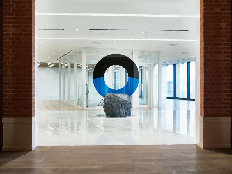
On the occasion of our 140th anniversary, we relocated our headquarters office and redesigned our corporate logo for the first time in approximately 60 years. We also created a commemorative monument to be installed in the lobby of the new office.
The Toyobo Group aims to be a group that will continue to create the solutions needed by people and the Earth under its corporate philosophy of “Jun-Ri-Soku-Yu”. In the new corporate logo, the wash of black expresses space, while you can see the curve of the earth in the blue part beneath. It’s a design that embodies Toyobo’s firm commitment to solving the Earth’s problems through its technologies and products. By eliminating the border that previously surrounded the logo, we visually convey the openness our company aims to embody.
TOYOBO's technologies and products are used to solve a range of problems faced by the planet and its people.
Limits are there to be exceeded. Toward the future, let us continue to challenge together.
We rally behind the call of "Beyond Horizons," taking its instruction to continue to push limits and challenge what is possible.

Comments from Taku Satoh
This logo does not have an enclosing line around the lettermark. It is utterly open to show this is a company that is ever more open to the outside world. I designed the fonts to secure an image of universality, not limited just to TOYOBO's textile work, that will not become outdated as times change.
I also incorporated the Earth’s outline as seen from space into the logo. In other words, the TOYOBO logo serves as a window for looking at the Earth from space. It embodies Toyobo’s overall vision and its determination to push ahead with various business operations in harmony with the environment of our planet.