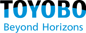
We renewed our logo, which it has used since 1963, from April 2022 to mark the 140th anniversary of its foundation. The new logo was designed by renowned graphic designer Taku Satoh.
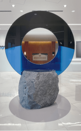
The Toyobo group aims to be “a group that will continue to create the solutions needed by people and the earth” under its corporate philosophy of “Jun-Ri-Soku-Yu” (adhering to reason leads to prosperity). The black part of the new logo expresses space, while the blue part indicates the earth's outline. It's a design that embodies Toyobo's firm commitment to solving the earth's problems through its technologies and products. And not having an enclosing line around the new lettermark -unlike the current one -provides a visual reminder that the company is ever more open to the outside world.
The tagline was "Beyond Horizons," meaning "go beyond, go further." Toyobo's technology and products will solve a variety of problems facing people and the earth. Limits are meant to be exceeded. The message is to continue to take up challenges toward the future together.
News Release dated January 26, 2022 “Toyobo renews its corporate logo”


